Content accessibility for a research institute.
Data & Society • 2017 • Desk Research, Strategy, Concept
Summary
Desk research and design concepts for increased content access and promotion of journalistic research.
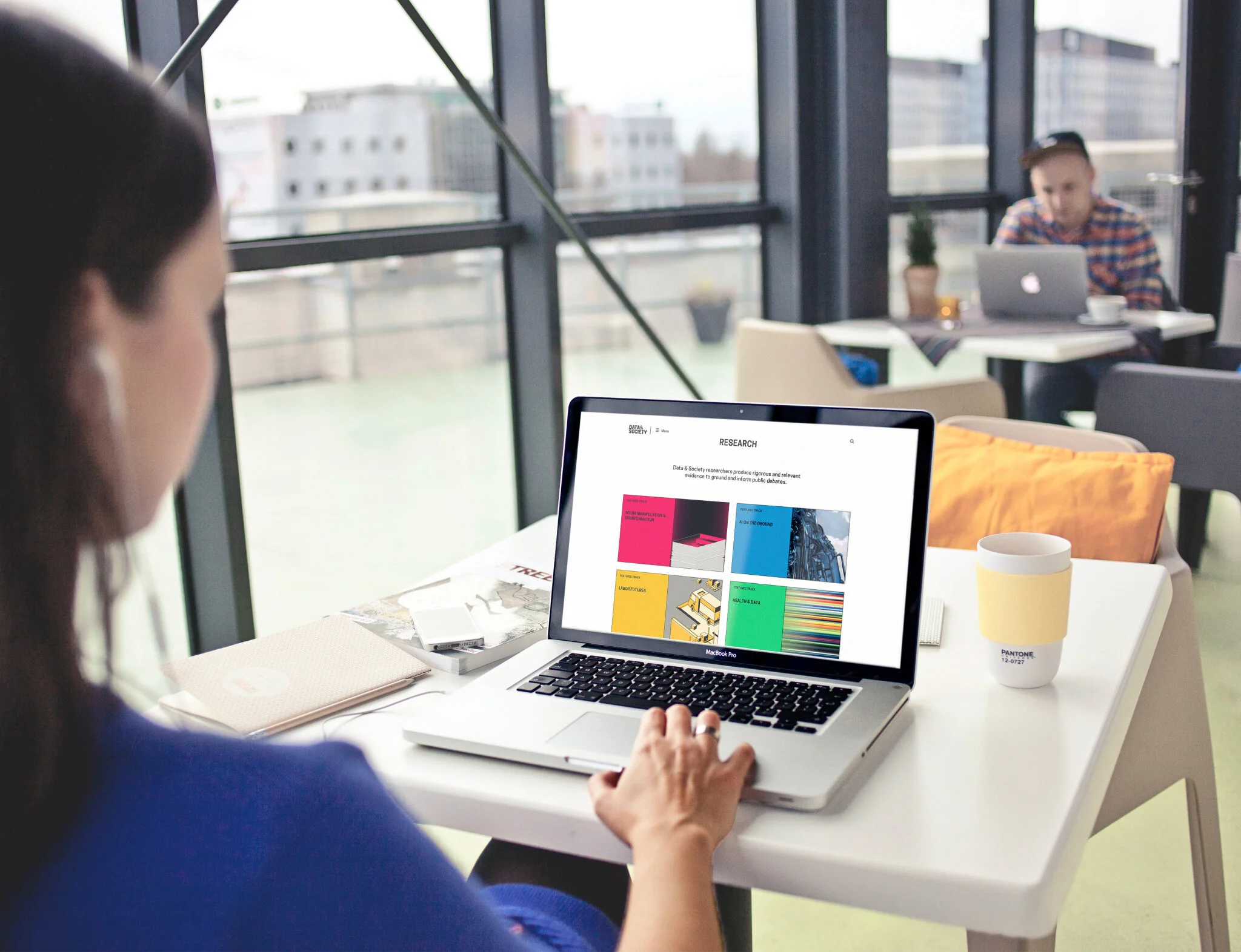
Empathy Equation was hired to analyse an NGO’s website and support them with a redesign of their online experience and as well as define a rollout strategy for their near future development. Based on the research, the short but interesting collaboration yielded several design concepts and led to the redesign of the website.
Desk Research
Setting a status quo
1. Analysing use flows, traffic etc.
Being granted access to Data & Society's Google Analytics, we first analysed the past and current traffic, which - albeit encrypted in numbers and percentages - gave us valuable insights about who the different users are and how they behave on the site.
2. Archetypes
Using the results from our analysis of both, traffic as well as market competitors we were able to create archetypes (a "light" persona, that isn't as rich and based on actual user research as a "real" persona but a general character based on previous desk research.
3. Design recommendations
This helped us to get a better understanding of the user and thus the site they need. We created a comprehensive list of action areas that need further development or require improvements and laid them out in a strategic rollout map, a strategy for which improvement enables which additional feature etc.
4. Creating a new taxonomy
Additionally, we recommended a new site taxonomy (IA) that organized the extensive and diverse content in a more accessible and structured way.
Strategic consulting
Strategizing future growth
To provide structure and overview for the website's future development we created a rollout strategy map that depicts the different features-to-be and how the website's experience and service will grow with them.
As often with rich documents, roadmaps can be hard to communicate and fail to reach an audience beyond the project team. To solve that problem, I used principle and proto.io to create an interactive document that could even be downloaded and shared amongst departments and colleagues. Being clickable allowed the roadmap to highlight and explain individual features by itself without much assistance from a presenter.
Want to know more? Get in touch


